Sunday, 30 October 2016

RESEARCH: Timeline of key events in indie rock history

KEY EVENTS:

  • 1979: Postcard Records founded in Glasgow. Played a part in the birth of British indie rock music, particularly the C81 and C86 indie pop movements.
  • 1980: Dischord Records established by Ian MacKaye and Jeff Nelson. Record label specialized in indie punk rock music scene based in Washington D.C.
  • 1981: American experimental/post-punk/indie rock band Sonic Youth founded by Thurston Moore (vocals, guitar), Kim Gordon (bass guitar, vocals, guitar) and Lee Ranaldo (guitar, vocals) followed by a wave of short-term drummers in 1985, the most prominent being Steve Shelley (drums).
  • 1986: Sub Pop Records founded in Seattle by Bruce Pavitt and Jonathan Poneman. Signs bands Nirvana, Soundgarden, Sleater-Kinney and more.
  • 1990: Riot Grrrl band Bikini Kill formed. Members: Kathleen Hanna, Kathi Wilcox, Tobi Vail, Billy Karren.
  • 1991: VERY MAJOR DATE FOR INDIE ROCK MUSIC: Nirvana signs deal with major label Geffen Records. Second album Nevermind reaches US #1 on the Billboard Hot 100, where they break out into the mainstream. Their success allows Pearl Jam with Ten, Stone Temple Pilots with Core, and Soundgarden with Superunknown to also enter the mainstream alternative rock trend.
A final note:
Because more bands found solace in the mainstream now, the term "indie rock" is blankly applied to any new, emerging artist or band with a jangly guitar sound and catchy rhythms. This ignores any artist's affiliations with record labels or their ethos.

OTHER COMMENTS:

  • Britpop was first influenced by the likes of American grunge music, especially the opularity of Nirvana.
  • The Madchester scene developed in Manchester in the early 1990s. A root of Britpop, this scene included artists such as the iconic Stone Roses, James, The Charlatans and the Inspiral Carpets. It blended alternative rock, psychedelic rock and electronic dance music. Yet Madchester was driven by drugs, particularly MDMA.

RESEARCH: History of indie rock music

Three-piece Irish indie rock band Two Door Cinema Club, who have released three studio albums to date. Their latest is "Gameshow", which was released on 14 October 2016. Members [left to right]: Alex Trimble, Kevin Baird, Sam Halliday


Sonic Youth, an American indie rock band.


Blur's lineup.

Oasis

Pulp
Suede (2015)


Indie rock is dying a slow and painful death (2012 Guardian article)
A detailed history of indie rock music

RESEARCH: More on "history of music videos"


Friday, 28 October 2016

PROGRESS (+RESEARCH): more inspiration for digipak album cover

Decade in the Sun: Best of Stereophonics (2008)

Here is the cover for Welsh rock band Stereophonics' compilation album "Decade in the Sun: Best of Stereophonics". It depicts four musicians walking towards the camera, all with outfits reminiscent of their musical genre (rock).

Mise-en-scene: band members dressed up in bomber jackets, T-shirts and jeans - vocalist Kelly Jones does not wear a jacket on top to reinforce his place as lead singer of the band. Two out of four are also wearing sunglasses to coordinate their attire. This is particularly to establish the Welsh rock genre and also to match with the backdrop on the album cover - a hot, humid desert.

Backdrop: a desert in retrospect - black and white; easily captures the feel of the band's greatest hits dating back from 1992 to 2008 all compiled on the album. Chosen colour scheme easily matches the alternative rock genre.

Masthead: all in fancy lettering. Band name font is bold and is distinctively different from "Best of" and "Decade in the Sun". Additional gold logo is there to get audiences to recognise who they are - Stereophonics have been there for more than a decade!

Evaluation: I particularly like how the front cover of this compilation album is laid out as it proves that a musical journey in retrospective can easily flesh out the ego and talent of the band themselves as they have a loyal fan following that they can look up to. Fan support brings out their inner selves once more! Stereophonics are a really successful Welsh rock band with a number one "Dakota", which rock music fans will recognise and therefore their fan following will expand to appraise them in their performances.

These codes and conventions will inspire me to create an album cover for Lymington's debut album digipak which will greatly astound existing Lymington fans and alt rock alums alike. And with the band members walking in front of the screen like they are about to address their audience in an interactive manner, this strategy will ensure the band's commercial and critical success. The band logo/masthead on the front cover will also be in a bold font, so as to distinguish from the as-of-yet unknown album title, complete with a unique logo that will frequently appear on my ancillary products.

Like all other alternative rock bands photographed by professionals, I would have Lymington wear leather/bomber jackets complete with jeans and (occasionally) sunglasses to reflect the rock vibe.

Wednesday, 26 October 2016

PROGRESS: Storyboard for Vodka and Cherryade


Note: flickering during scenes may be included to induce flashbacks.
More will follow as the storyboard consists of what shots I will include in the final music video for "Vodka and Cherryade".

Friday, 21 October 2016

RESEARCH: Inspiration for my digipak

"None the Wiser" by The Rifles (2014)

  • Indie rock band The Rifles' "None the Wiser": simplistic album cover featuring four members of the band (Joel Stoker, Lucas Crowther, Robert Pyne, Grant Marsh - Dean Mumford is not featured). Black and white - monochrome.
  • Rifles band members are all wearing casual outfits.
  • The Rifles masthead is kept in the same font - see here on their album "Great Escape":

  • Album cover features all four members again, this time shadowing them under a shade of black to establish their indie rock status (they are not known universally by the general public). They are playing their respective instruments.
  • As described above, The Rifles masthead font is kept the same.
Also, I gained some more inspiration for my digipak cover from this single cover for The Sherlocks' "Last Night":


Represented here is an urban London estate. A figure is slumped down on the brick wall smoking a cigarette. Person sports a mullet.
The Sherlocks masthead also keeps the same font intact.

Looking at these different aspects of album covers, I aim to use an urban neighbourhood as the background of the album cover along with the six band members of Lymington with their respective instruments as props to enhance the recognition of the indie rock genre. This will provide viewers with a gist of what characteristics there are to expect on a related album cover.

Wednesday, 19 October 2016

PRODUCTION: Summary of codes and conventions for my music video and eventual song discovery


  • First of all, the preferred genre of music I chose to research was indie rock music, a subsidiary of the largely-expansive rock music sector. To make sure I stuck to this genre, I made sure I included many artists from the same genre (even if that means including artists from other sub-genres of rock). For example Jamie T, who I have researched into by analysing the latest vinyl digipak released: "Trick" (2 September 2016); he is identified as belonging to the indie rock/British hip-hop/alternative rock genre despite being a singer-songwriter. I have recently researched the Courteeners, who are classified as 'indie rock'; The Hunna, who fall under the genre(s) of alternative/indie rock, and Sundara Karma ("Sundara" = Sanskrit meaning 'beautiful'), a Reading four-piece indie rock band.
  • The codes and conventions typically used in their music videos would be my inspiration for producing my music video. They are part of the springboard for choosing my preferred musical artist to feature:

Lymington (renamed Robin Ridge*) for copyright reasons

*subject to change.

Members [from left to right]: Jake Stobbart, Sean Gill, Elliot Rose, Leo McDonald, Freddy Smith (James Aris not pictured in the band portrait)

Once I had researched into my initial genre of music, I looked at music videos of the same genre on YouTube. This gave me an idea of what codes and conventions to include in my own, for example: 

  • The band name as the masthead showing up in bold (as seen in Sundara Karma's music videos for "A Young Understanding" and "Vivienne"). See below:
Band name and song title both flash in black and white on the screen in the respective music videos. This brings attention to the audience as they are in the same font, clearly following the codes and conventions of Sundara Karma's brand image.  This bold font is prominently featured in their music videos and the cover for their forthcoming debut album "Youth is Only Ever Fun in Retrospect", helping to sell the band to their target audience better.

  • Album cover below:

Furthermore, Sundara Karma include a sun symbol alongside their ancillary products. Said symbol has appeared in their single cover for "Flame":


There it is again on the front cover. This helps to sell their brand image as it is a recurring motif across their released ancillary products.


  • This gave me the idea to include a recurring trademark symbol for my chosen band. With its use, teenage indie rockers will recognise the motif in each one of my ancillary products. "Audience appeal"
  • I will use the same font for each of the ancillary products I will create in order to maintain brand image. Audiences would recognise the symbol regularly throughout the ancillary products.

HISTORY OF MUSIC VIDEOS | MICHAEL JACKSON


Friday, 14 October 2016

RESEARCH: Andrew Goodwin's theory applied to music videos

Goodwin's music video theory suggests there are five key aspects to every video.

The aspects are as follows:

  • Thought beats as in visualising the sound in your head
  • Narrative and performance
  • The "Star" image - so making the key artist/band the main aspect of the music video just by using key performance shots to make them more prominent.
  • Technical aspects of music video.
  • Relations of visuals to the song.

Thought Beats

  • First of all look at the music itself. Take into account its structure e.g. verses, chorus, bridge, refrain.
  • Second of all look at the voice of the song. The artist featured in the music video has an extremely unique voice which identifies with the audience. Also can act as a trademark which works well with the star image.
  • Lastly, Goodwin points out the artist's mode of address. There is a narrative in the music video, that which tells a story to the viewer. The artist is perceived as a storyteller in this sense, and therefore the music video acts as a communication device, one which tells a story and the audience responds by listening to it.

Narrative and performance


  • We do not get treated to the complete narrative of a music video! Only a fragmented gist of the narrative of the song can be achieved. Other individuals can make up theories about it or generate their own ideas about what the meaning of the song is.
  • Coherent repeatability - like an earworm in someone's head. Encourage viewer to watch video as many times as they like without loss of interest
  • Narrative not important in role of advertising.
  • Artist acts as both narrator and participant - increase authenticity - however lip syncing and mimed actions are core of music videos. Inject ideology to the audience that 'this is real'.

Star image

  • Vital aspect of music videos
  • Meta-narrative - describes development of star over time - vital part in music video production process while still appealing in a unique way they are portrayed to the audience.
  • Star image is very unique in the way they are presented e.g. Abél Tesfaye (The Weekend)'s hairstyle, other costumes, moves and appearance.


  • This helps to promote the artist's star image in public, also promoting the video in a dual role whilst creating a public reputation for the artist.

Relation of visuals to song

  • Illustrate - most common aspect of music video - set of images in music video
  • Amplify - related to repeatability - manipulating meanings and effects constantly shown throughout video. Constantly drummed into our heads.
  • Disjuncture - ignore meaning of the song so narrative is not made important at all.

Technical aspects

  • Goodwin discusses this feature as the glue which holds music videos together through the use of mise-en-scene, editing and visual effects.
  • For example, lighting and visual effects help to set the mood for a music video. The Courteeners' "Are You In Love With a Notion?" uses sparking visual effects during the chorus to create a dramatic visual emphasis and thrill the audience.

  • Mise-en-scene is also used to benefit the music video production. Another vital aspect - helps the artist gain authentication, making his work appear more professional - THEY STAND OUT MORE TO THE AUDIENCE...
  • Beats of the song create effective cuts that complement the rhythm which entertains the audience.

Thursday, 13 October 2016

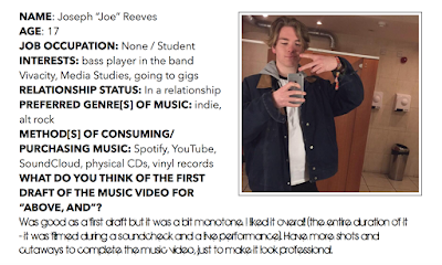
AUDIENCE RESEARCH: Focus group


Focus group

There are four different character profiles to investigate. I will ask them what they all think of the first draft of my music video for the song "Above, And" performed by Lymington (Robin Ridge* for copyright reasons).

*subject to change in future


Tuesday, 11 October 2016

Vodka and Cherryade lyrics

ALMOST 100% ACCURATE! Lyrics belong to Lymington.
Just because I couldn't find the actual lyrics anywhere on the Internet, I had to copy them up to Pages...


PROGRESS: Second music video "Vodka and Cherryade"

After learning that the music video I composed for "Above, And" was lengthy in terms of editing and cutaway shots, I decided to make a second music video for Lymington (Robin Ridge because of existing brand image)'s commercial single "Vodka and Cherryade". The intro was composed of cutaway shots from their soundcheck dating back to July 21, 2016, in time with the guitar riffs of the intro.

Wednesday, 5 October 2016

RESEARCH: Jamie T: Trick (VINYL) - digipak analysis

Jamie T "Trick" (2016)

Genre: indie, post-punk revival

Jamie T's fourth studio album, Trick, was released on 2 September 2016. The album cover depicts a naked man with scruffy black hair pointing at the air. Around him are working-class citizens wearing flamboyant outfits, most of which are gossiping to each other while those near the stairs look up at the centre figure. There is a crowd of four shirtless figures, one of which is holding a torch while he is draped under a white flag. The entire album cover is a painting by Paul Falconer Poole entitled 'Solomon Eagle'.

Depicted here is a Quaker with a burning pan of charcoal on his head "denouncing of judgement upon the city". The painting offers a visual aesthetic which represents the overall theme of Jamie T's studio album.

The masthead is not present on the album cover packaging which enforces a sense of enigma upon the audience, but also challenges the codes and conventions of a normal digipak simply because the genre of music is indie. Also, there is no price tag present on the album; the latter would be only found when the vinyl record is sold in mainstream media shops such as HMV and other local stores.


The back of the 'Trick' vinyl cover depicts a rotting yellow wallpaper draped with flowers. A much more simplistic layout than the front cover, this symbolises a poverty-stricken house interior, reminiscent of one in a deprived borough of London. Some of the wallpaper is torn apart, with the barcode on the top right and the Virgin Records logo below it. The torn wallpaper depicts a contrast between the front and the back cover, with the latter representing disarray in the home where it used to be beautiful.

Tracks on Side A and Side B are displayed in bold white font in the middle of the backdrop.
This is a common convention found on all vinyl digipaks, with five tracks on both sides.
The vinyl record shows a symbol of a cracked black and white skull in the middle - one seen on the front cover of 'Trick'; the skull emblem was designed by Shaun Paterson. This is a repeated motif used by Jamie to establish branding in his product.


The inner fold of the vinyl record for Jamie T's "Trick" contains all the lyrics to the 12 songs split over 6 vinyl discs. In addition to this, they resemble newspaper cuttings placed on top of a collage of various Jamie T-related images. This is to reflect the indie genre - a quite unusual way of designing a backdrop for the album inner art, which also shows Treays' creative innovation. (Conventional art).

Brand image is evident because the same skull logo on the album cover and back also appears on the left side - eagle-eyed viewers will recognise the skull as a symbol of familiarity - the same motif that repeats often throughout the album packaging.


Jamie T's creativity expands as the gatefold contains a collage of different photographs cut and stuck down on the surface as an artistic backdrop. Twin acoustic guitars can be seen, as well as a parade of revellers and the word "TRICK" on the right. The man with the burning urn and pictures of Jamie T himself along with historical photos are part of the collage. All of this information clearly fits the indie genre, whilst clearly challenging the typical codes and conventions of most digipaks because the gatefold and inner cover obviously doesn't stick to a specific colour palette.

Jamie clearly uses his time in the studio constructively, effectively spending it on the quality of the gatefold and inner cover, while in contrast using a painting as the album cover and a house wallpaper as the backdrop for the back cover for "Trick". Overall, the digipak represents the unique innovation of a musical artist seeking to win appeal from their fans in a particular way, not concerning their physical appearance.

OTHER DIGIPAKS BY JAMIE T:

Jamie T "Carry on the Grudge" (2014)
Jamie T "Panic Prevention" (2007)
Jamie T "Kings & Queens" (2009)


Jamie T's latest album is clearly advertised on his website to promote sales and streams through various music platforms and even his own music store: Apple Music, Spotify, Amazon and Jamie T Store.

The skull motif is recurrent throughout his website to create a sense of branding, which proves effective for "Trick" to sell well across different media platforms. Young audiences will instantly recognise Jamie T's skull motif and subsequently will flock to view other Jamie T related products.

Courteeners - Are You in Love With a Notion? music video analysis [includes music video theory]


ADDITIONAL NOTES

  • Taken from Andrew Goodwin's music video theory: the record label includes the need for close-ups of the artist - they'll have a visual style which recurs across their work. Liam Fray, pictured in the fourth frame above, is shown in a close-up shot. This shows that the Courteeners' record label [PIAS Cooperative for their album ANNA; Ignition Records for their latest album Mapping the Rendezvous] expects much of their prominence in their music videos.
  • Additionally, Fray seems to be "breaking the fourth wall" as he is singing to the camera - a simulation that he is directly addressing the audience.
  • Regarding shot #2: it is actually the notion of looking. The lead character's girlfriend is looking seductively at the camera in an over-the-shoulder shot, suggesting that we as the audience should look at her feminine beauty from our POV.

Sunday, 2 October 2016

Progress: Robin Ridge - Above, And (initial music video draft)

Robin Ridge (Lymington) - Above, And - Music Video (First draft) from Josh Pamfilo on Vimeo.

I like how Freddy, the lead singer, perfectly lip syncs with the vocals of the music track. Footage shot dates back to Thursday, July 21, 2016; this was when the band played a soundcheck at Chinnerys at Southend before their evening gig. The cutaways at the end involving guitarists are effective as they evoke the alt rock genre via the mise-en-scene. For the shaky camera shot involving two band members throwing stones into the sea, a contrast is provided between this and a steady camera wide performance shot of RR playing the song.

However, there are a number of improvements. For starters, most (if not all) of the shots are too lengthy - I may require a number of cutaways to quicken the pace of the video. There has to be some clear narrative in the music video itself as it is a necessary convention most indie/alternative rock music videos have (see BLUSH's "Daggers" for example). In terms of this, I would include a narrative of a girl dancing in a nightclub OR people dancing at various parties as an example. This would really enhance the music video better, therefore attracting more audience members to watch the video.