Wednesday, 21 December 2016

MUSIC VIDEO PROGRESS: LEGO Lymington

Lymington, only re-imagined in LEGO form. (l to r: Elliot, Leo, Sean, Freddy, James, Jake)
For certain cutaways in my final draft, I decided to follow a more conventional path: using stop-motion animation mechanics. This would fill in for any band close-ups and footage that I missed out on filming from last July during their Chinnerys performance. I built a drumkit for Sean to use for close-ups as well as given four band members guitars to focus on during filming. This was an innovative approach to filming live action music videos.

PROGRESS: Final digipak/jewel case images

Front cover featuring all six members of Lymington
Displayed here is the album artwork of Lymington's debut album, "Vodka and Cherryade". All six band members are displayed in the centre, which is an album artwork convention. The cherry motif is shown as "graffiti" on the sky blue wall - using this technique, it blends well in the background, confirming brand identity.

Each typography element contains a drop shadow, which makes both masthead and album title stand out better from the background. There is a single straight line in the band name, which is a normal convention for indie/alternative rock bands, as the occasional line appears in their logos.

Examples include: Muse; Foals; Violent Soho (on "We Don't Belong Here" only); Young Guns ("Echoes" only)

Back cover dimensions: 15.1 x 11.6 cm
Back cover is slightly enlarged to fit the dimensions of the jewel case/digipak. Cherry motif occasionally pops up in subtle places such as the spines and the guitar displayed with the drumkit. This establishes evidence of brand identity within the album.

There are many codes and conventions clearly evident within the back cover. These are:

  • The tracklisting in a bold font and white colour making it stand out.
  • Barcode - added to make product look professional.
  • Record labels: End of the Trail Records, under exclusive license to Rough Trade Distribution.
  • Production number
  • Website(s)
  • Copyright blurb at the bottom. It is shown that the product looks professional since it is "made in the EU" and "unauthorised copying" of the work is prohibited.
  • Album title and band name on both spines
White font is carried on in the back cover to maintain the in-house style, complemented by the blue colour scheme on both spines.

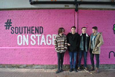
(from left to right:) Jake Stobbart (guitar); Freddy Smith (vocals); James Aris (guitar); Sean Gill (drums)
Most surprisingly, the inner cover features four out of six Lymington members posed against a brick wall with a pink banner entitled "#Southend ON STAGE" (original image cropped to fit dimensions of digipak inner cover). Touring members Elliot and Leo are not present in the shot since they support Lymington throughout their live gigs and did not attend the photoshoot.

This shot featuring the pink wall was chosen as I wanted to display a variety of images throughout my ancillary product. In addition, the same cherry motif is present blended in the background, clearly following brand identity.

Cherry motif.
For this inside right cover behind the CD, I have decided to follow more simplistic territory by displaying Lymington's iconic cherry symbol, but enlarged. Using Photoshop's marquee tool, a 3D effect was created, further adding creative depth to the visuals. This is unusual for indie bands aiming to rise to local fame.

Patent and copyright text is elliptical around the label - all rights reserved; production number is shown but it is upside down.
Again, the same blue colour scheme was used for the CD label. This time, there are two of the same cherry motifs on both sides. I added elliptical copyright text around the edge of the disc lining to conform to normal codes and conventions of the label, along with Lymington's record labels, band name and album title. Both masthead and album title have a drop shadow on it and are both in the same typography font to stick to its house style.

Lymington - "Vodka and Cherryade" first draft

Lymington - Vodka and Cherryade (final draft) from Josh Pamfilo on Vimeo.

Here is the music video for Lymington's "Vodka and Cherryade". There are many major subtle changes to the music video, including new shots of Lymington's band members walking down Southend Central and talking between themselves. There are high-quality shots of Joe and Lucia throughout the video, and it includes some occasional stop-motion of each of its band members playing their respective instruments to fill any missed footage. Freddy is shown lip-syncing in various areas of the video, and there are extreme close-ups of the lead singer himself when he sings the chorus "Though it wasn't good enough / and though when times were usually rough / You can never say that you regret".

I am deeply satisfied with how the new edit of the music video turned out to be because the last draft involved Lymington performing a different song which does not sync with the vocals of the studio recording. Following on from that, I completely restructured the video clips of V&C and replaced its layout with a new structure which flows well with an improved narrative (which may seem fragmented).

Monday, 19 December 2016

Inner cover for CD insert and disc artwork discussion


Here is the official CD insert for Lymington's "Vodka and Cherryade". In contrast to the sophisticated covers I composed for the digipak/jewel case, I decided to turn to a more simplistic approach. Pictured here is their iconic cherry logo, albeit enlarged to suit the CD casing when the disc is removed. However, there is a major subtle change: it is manipulated to create a 3D effect, which may seem unnerving for viewers or fans of Lymington (or anyone who attends their gigs at Chinnerys). Green and red outlines are visible around the cherry's edges, therefore adding to the glitch effect of disorientation.

The same blue background complements the album cover as it can be found there, as well as on the disc artwork.


A simplistic approach was also taken in composing this CD artwork. Codes and conventions:
  • It will always show the artist name on top (hence Lymington).
  • There may, or may not be, the album title (Vodka and Cherryade).
  • Record label logos are always present on the CD. Rough Trade... End of the Trail Records in this case.
  • Its circular design allows copyright blurb to arc around in an elliptical motion. It will always mention which record label the band are signed to, all rights reserved.
  • "Made in the EU."
  • "BIEM/GEMA". Indicates statutory license agreements of patented products within European countries.
  • Production number is shown at the end of the elliptical text.
  • The cherry motif is ALWAYS shown in Lymington's promotional artwork and merchandise.
  • Simple blue background used for most of the digipak colour scheme - maintains house style and ANCHORAGE.
  • Band name and album title is ALWAYS presented in the SAME font as the ALBUM COVER and SPINE.
I took inspiration from Nothing But Thieves' debut album, which also took a simplistic approach to the CD artwork and inside in which no complex artwork was added:


PROGRESS: Changes

On the final copy of my back cover for Lymington's Vodka and Cherryade, I have altered the track name of "Little Belief" to "Carry On with the Silent Treatment". During photoshoot sessions with band members, lead singer Freddy revealed that this track is still work-in-progress and that they haven't mastered it yet.
Another song, D.I. Dead, was added to the tracklisting.

And the red cherry motif was replaced by the black cherry symbol shown on the band's ancillary products to show brand identity.

Talent shots.

Lymington


PROGRESS: Branding

In order to maintain branding within my ancillary products, I decided to include the same cherry symbol within the digipak and magazine advert. The results were as follows:


Additionally, I altered the inner cover drastically, removing the monochrome filter. Initially, I photoshopped two missing members who did not attend last Saturday's photoshoot for the ancillary products (Elliot and Leo, who are both present on the album cover and in various cutaways in the music video). This plan seemed to work well, even with blending Leo and Elliot in the picture, until I realised that they looked out of place because they had no realistic shadows behind them. Therefore, I removed them entirely, along with the black and white filter, due to the strong pink overwhelming the background. In place of the scrapped elements I added the cherry motif (same symbol) to establish their brand identity.

Sunday, 18 December 2016

PLANNING: Storyboards for Vodka and Cherryade (first draft).

Here is the hand-drawn storyboard for Lymington's Vodka and Cherryade (terribly drawn but it does provide cohesion into what would be outlined in the narrative). This was created at the time I composed my music video. Shots in the storyboard were clips I decided to include in the music video as they are fitting for what I wanted in Vodka and Cherryade.


Also included are shot ideas for my LEGO stop-motion cutaways of the band since I had no additional footage befitting the guitar emphasis shown in typical indie/alternative rock music videos. It was planned for conventional uses.

How research has informed my practice: Other music videos.


Before editing my final draft of Vodka and Cherryade, I undertook research into indie music videos. Such instances like Sundara Karma's "Vivienne" and The Hunna's "Bonfire" have made me realise that different music videos have different codes and conventions in order to stick to their chosen genre. You can see how these conventions have crossed over to their ancillary products.

Sundara Karma logo and sun motif below (click the first image for logo above the sun):


Other codes e.g. band name and song title in the music video have helped me to choose which ones to incorporate into my own indie music video. There are wide performance shots present in each of the videos I have researched into, yet the narrative is often fragmented or doesn't fall under the indie rock label. The artist lip-syncs with the song itself, which is a convention I have added in my final draft (which required reconstruction to do so). Much of my narrative consists of a couple in a relationship, which is also present in Sundara Karma's music video for "Vivienne". Both videos fall under the indie genre.

There are a few wide performance shots in my music video, though much of the footage shows band members at separate times of the day.

Carol Vernallis' music video theory based on narrative indicates that music videos have a partially completed or incomplete narrative with the video being disjointed, disconnected or fragmented in a way or two. There is a driving factor but it's not necessarily the narrative; either it's the music (its pace) or other elements of the video. However when the video is incomplete it can lead to many questions being asked about what the narrative actually is.

The music video for "Vodka and Cherryade" is presented throughout a montage of band footage and various gig and party scenarios, rather than just one clear focus, making it complicated to figure out its centre point.

Contact sheet (progress)


Three examples of a large compilation of footage that was filmed and chosen (some) for the final cut of my music video for Lymington's "Vodka and Cherryade".


I compiled these clips into iMovie, where I edited most of the professional shots and cutaways into my final music video.

NOTE: The first two screenshots are taken from an earlier draft of Vodka and Cherryade, where most footage did work for a narrative, yet it was left unfinished.

The next two screenshots, however, are taken from a better version of the final draft where Freddy properly lip-syncs to the song and there are footage of each of Lymington's band members, making it seem more professional.

LOG PROGRESS: Brand identity, typography and colour scheme


In order to secure Lymington's iconography I decided to implement the cherry motif into each of the digipak/jewel case elements. Front cover, back, gatefold, inner cover and CD artwork.
This reinforces a sense of branding for the artist, which will attract more music fans to recognise them as a unique band.

I kept the typography of the band logo the same throughout all of their products. This establishes a clear brand identity compared to their cherry motif present. Despite the font colour often changing (as seen on the spine) its typography still remains the same, anchoring Lymington's identity since it repeats throughout their ancillary products. Even in their magazine advert the font never changes.


Chosen colour fits into their house style: light blue. It is clearly shown on the album cover and magazine advertisement, anchoring their brand identity. This blue colour is also present on the album spines and inner CD cover, anchoring their chosen house style.

Friday, 16 December 2016

PRODUCTION PROGRESS: Magazine advert


This is the original image I started off with, only a little bit brighter courtesy of the "Vibrance" option under the Layers tab. The top half consists of existing screenshots of the brick wall, only duplicated a few times to emulate a landscape shot that would fit a music magazine advert. Same with the bottom, yet the result would end up becoming a distorted repeating effect, a glitch-like perception.

I kept the font for Lymington's masthead the same as it promotes branding of the indie rock band throughout all of their ancillary products: their album cover, this magazine advert promoting their debut album and their gig advertisement.


Here is the music magazine advert with added promotional text. "Vodka and Cherryade" is stylized in the same font as its counterpart on Lymington's album cover much like its band name. By adhering to the codes and conventions of magazine adverts, the following text was added: "The debut album out January 14".

The functions of music magazine adverts are:
  • To sell the song/album
  • To promote the artist
  • To be eye-catching to the viewers.
Codes and conventions:
  • Release date
  • Album title
  • Song name(s)
  • Image of album cover
  • Artist name (in this case, Lymington)
  • Album information e.g. "Includes (Track 1), (Track 2) and so on"
  • Where it is available to purchase
  • Record label logo
However, as soon as I found out that one convention was to stick to the image of the album cover, I changed the overall background of the magazine advert so as to keep in line with existing codes and conventions.


And with the imminent image change came a font alteration as well; the font for each album title changed to Antipasto to make it look more professional.

The distortion effect was not affected by this change.


Same magazine advert (work-in-progress), but with added record labels:
  • Rough Trade Records.
  • End of the Trail Records, distributed by aforementioned record label above.
Both are independent record labels. End of the Trail Records is home to bands such as BLUSH, Family Jools, Coquin Migale, Keep Breathing, and SLTP. Artists like Warpain, Parquet Courts, SOAK and Palma Violets are signed to Rough Trade Records.

I chose both because they specialise in indie music, and by knowing which record labels Lymington are signed to, listeners would get an idea as to which kind of music to expect when purchasing their album.

Including End of the Trail Records promotes regional identity - BLUSH is signed to that label, and by signing Lymington under BLUSH's record label, they both make Southend-based indie powerhouses. Both BLUSH and Lymington have played separate live gigs around Southend, most commonly Chinnerys, home to various artists throughout the years.


Later, I added an album review (four out of five stars). This informs the audience that critics have praised the album before its actual market release, spreading positive word about the genre of music people expect to listen to. (Courtesy of NME, a music journalism magazine well-known to music fans alike).

The release date is important because it lets audiences know when to grab a physical/digital copy of Vodka and Cherryade. Song titles have been implemented so that consumers will know what the songs are called - they might even pick their favourite song out of the album and add it to their own personal playlists.

Located at the bottom left is an "Available on iTunes" icon so audiences will know where to purchase the album. Not only that, but the hmv.com motif at the bottom right reinforces this view as well.

It is common for artists to have their own websites, hence lymingtonmusic.com at the bottom of the music magazine advert. Here, people will find out more about Lymington's upcoming gigs, album releases, band information and photo gallery.

"Lymington" is kept in the same font and serves as a masthead for the majority of their ancillary products. The audience must know who they are, which will help promote the artist and help them gain more fame in the music industry (not to a really large extent where other record labels will exploit them for money and fame).

The image helps audience to know what the album artwork looks like in order to purchase "Vodka and Cherryade". Here, it shows all six members of Lymington, all involved in a wacky photoshoot. Promotion of the band using this moniker is imperative because it looks more interesting in that way - making the advert more eye-catching.